2Environmental Justice: How income relates to environment.
2.1 Background
The types of places that organisms live–their habitats–depends on a variety factors. Habitat selection, the selection of particular habitats, results from real and perceived tradeoffs between the benefits from foraging and reproducing versus perceived risks of mortality (Stephens and Krebs 1986; Morin 1999).
In addition to selecting their habitats, organisms also construct elements of their own habitats, including nests and burrows, as well as broader habitat alteration. This is known as niche construction(Odling-Smee and Erwin 2013). Beavers build dens and dams, birds and wasps build nests, and bacteria, ants, and humans all construct elaborate multi-layered cities of thousands or millions of individuals. At the same time, organisms often damage the very habitats they create, through over-consumption of resources and over-production of waste products.
We know a great deal about how our own species (H. sapiens) construct elements of their own habitats. We also know a lot about how we migrate and disperse from place to place. Nonetheless, we have a lot to learn about our own species, and, in particular, about which factors determine the our preferred habitats and determine the changes we make to those habitats.
Economic wealth seems to influence many of choices by H sapiens, including our preferred habitats. Ed Wilson (1984), a famous evolutionary biologist, have proposed the Biophilia hypothesis, that humans love nature. Biomedical researchers have shown that we are happier and heal from injury and illness faster when we have access to plants and to the outdoors (Franklin 2012). If wealth generally gives us greater access to what we want, will wealthier people more often put themselves in closer connection to nature?
Specific socioeconomic data about H. sapiens populations may be particularly useful understanding both the causes and consequences of relations between wealth and nature. Wealth can be measured in a variety of ways. Median income, and percent of the population below the poverty line are common ways to measure the average wealth of individuals or small family groups.
Specific data about our landscapes maybe be particularly useful in generating ecological understanding of H. sapiens. Tree cover is the two-dimensional coverage of tree canopies that you would perceive in an aerial photo in seasons when trees have their leaves. Tree cover is relatively easy to measure from satellite imagery. Temperature, or the heat experienced by residents, can be a serious problem in urban areas because they create heat “islands”. Urban heat islands are areas which tend to absorb more solar radiation than would a natural landscape and then re-radiate this as heat experienced by its human and non-human residents. During heat waves, residents in urban areas who are especially vulnerable can suffer severe heat exhaustion or death. Some urban areas tend to get much hotter than others, and it is often related to tree cover and green space generally.
Trees provide enormous ecosystem service benefits, including to help mitigate pollution via uptake of carbon dioxide and carbon monoxide (CO\(_2\) and CO) and other greehouse gases. Trees can also help reduce pollutants that cause direct negative effects on human health, such as fine and ultrafine particulate matter (PM\(_{2.5}\), PM\(_{0.1}\)).
In this research project, we will use freely available online data to address whether there is an association between wealth and the wild. Specifically, we will address whether, if we compare different geographic locations, will we see a relationship between the median income of an area, and the percent cover of trees? The data we collect will allow us to explore a variety of related ideas, but we will start with testing Wilson’s biophilia hypothesis, which predicts that humans love nature. We will test my corollary of this, that humans who have the greatest degree of freedom of choice (the wealthy) will tend to live in areas with the greatest connection to Nature (a lot of trees).
The first of these two platforms, Tree Equity Score, gives fairly detailed information on cities over 50,000 residents in size. It provides information related to environmental justice, including levels of poverty, tree cover, and heat. Our second data source is from i-Tree.org and it provides fairly detailed information about tree cover and the ecosystem services they provide. (Ecosystem services are features of ecosystems that benefit humans, such as storm water protection, and shade for buildings). i-Tree also provides median household income.
2.2.1 Instructions
Tree Equity Score data
Go to our class Google Sheet for Tree Equity Score cities, and enter the name of a city (pop. > 50,000) that you will investigate. It must be different than what anyone else has selected. Add your name to your selected city.
Find the data for the city: click on the map inside the area of your city. Note that a map will typically display more than just your city. It will also display adjacent regions. For instance, the map for “Cincinnati, OH” displays Hamilton County and Covington, KY. Selecting an area will cause a data summary window to pop up on the left side. Confirm that when you click on an area of the map, it is inside the city you intended.
Selecting an area link to a Municipal Report. This report provides information for the city as a whole. Confirm that when you click on an area of the map, it is inside the city you intended. Select the link, Municipal Report.
Pick the data most relevant to our question: adjust the setting for the right-hand column graph to show Tree Cover (%) vs. People in Poverty %. You will use this column graph in addressing our overall question.
The Municipal Report provides a Tree Equity Score, urbanized area population estimate, percent seniors, and a percentage of people in poverty. Enter these into the Google Sheet. Add one Miami uniqueID per group to each observation (row).
Save the web page as a PDF, and name it with the city name and “TES” (e.g., “Cincinnati_TES.pdf”). If you would like assistance saving the PDF, read the instructions under the button “Share report ->”. Make sure to close the instructions before you save the page. This file will be a record of your data.
Make sure that you have entered the Tree Equity score and poverty percentage in the Google Sheet, and that you saved to your own computer your column graph of tree cover vs. percent of people in poverty.
OurTrees app, in i-Tree
OurTrees application in i-Tree. Select a location in which you are interested. Start with any location name, and select “Search”. The app will show you a location. If you would like to, you can change the location by simply clicking somewhere else on the map. You can choose either Street view or Satellite view (the data will be the same).
Enter the name of your selected location into our class a new spreadsheet, Google Sheet for OurTrees.
In the OurTrees app, select “Get Results! ->”.
From the “Benefits” tab, collect data on tree canopy cover (%), annual uptake of CO\(_2\) equivalents and 2.5 micron particulate matter (PM\(_{2.5}\)). Enter these into the OurTrees Google Sheet.
From the “Community” tab, collect data on total population size, number of seniors (>64), percent minority, median annual income, and percent impoverished. Enter these into the OurTrees Google Sheet.
Repeat the above steps for nine more locations anywhere in the world. Your locations must be different than what anyone else has selected in the OurTrees spreadsheet. Add one Miami uniqueID per group to each observation (row).
2.2.2 Graphing data to assess our predictions
I argued that the Biophilia Hypothesis leads to the prediction that tree cover will correlate positively with wealth. To evaluate this prediction, we should make a graph in which wealth is on the x-axis (horizontal axis) and tree cover is y-axis (vertical axis).
A couple of minor points: (1) Our prediction also implies that we should see a negative relation between poverty and tree cover. (2) We typically assume that the variable on the y-axis is a response to the variable on the x-axis, that is, that the x variable is causing variation in the y variable.
Given our data are continuous variables rather than categories, we should start by making a scatterplot of median income (x) vs. tree cover (y).
As the semester progresses, you will find R is very useful. Below, I provide you with code for an R script to easily make this graph.
# if needed, install these packages# install.packages("googlesheets4")# install.packages("ggplot2")# load these packageslibrary(googlesheets4)library(ggplot2)# Import data. # This code will require that you have permission to access our G-Sheet.# You may be asked to select various options and/or sign in to your# Miami Google account.# The function read_sheet() requires a Google Sheet URL in quotes, and# allows you to skip lines that are not data, # such as a table description.d <-read_sheet("https://docs.google.com/spreadsheets/d/1uYCuTziJiLNvVOQ9Q65BxdWcNgDF6EnF8L1T3O_yATw/edit#gid=0",skip=2)
✔ Reading from "iTree_OurTrees".
✔ Range '3:10000000'.
# Uncomment to show us the names of the variables# names(d)# make a scatterplotplot1 <-ggplot(data=d, aes(x=Median_Income, y=Tree_canopy_cover, label=`City (only)`)) +geom_text() +labs(y="Tree cover (%)", x="Median income", title="No relation twixt tree cover and income?")ggsave("myCoverIncome_text.png", plot=plot1, width=10, height =10)plot2 <-ggplot(data=d, aes(x=Median_Income, y=Tree_canopy_cover, label=`City (only)`)) +geom_point() +labs(y="Tree cover (%)", x="Median income", title="No relation twixt tree cover and income?")# save the figure (dimensions in inches)ggsave("myCoverIncome_points.png", plot=plot2, width=7, height =7)
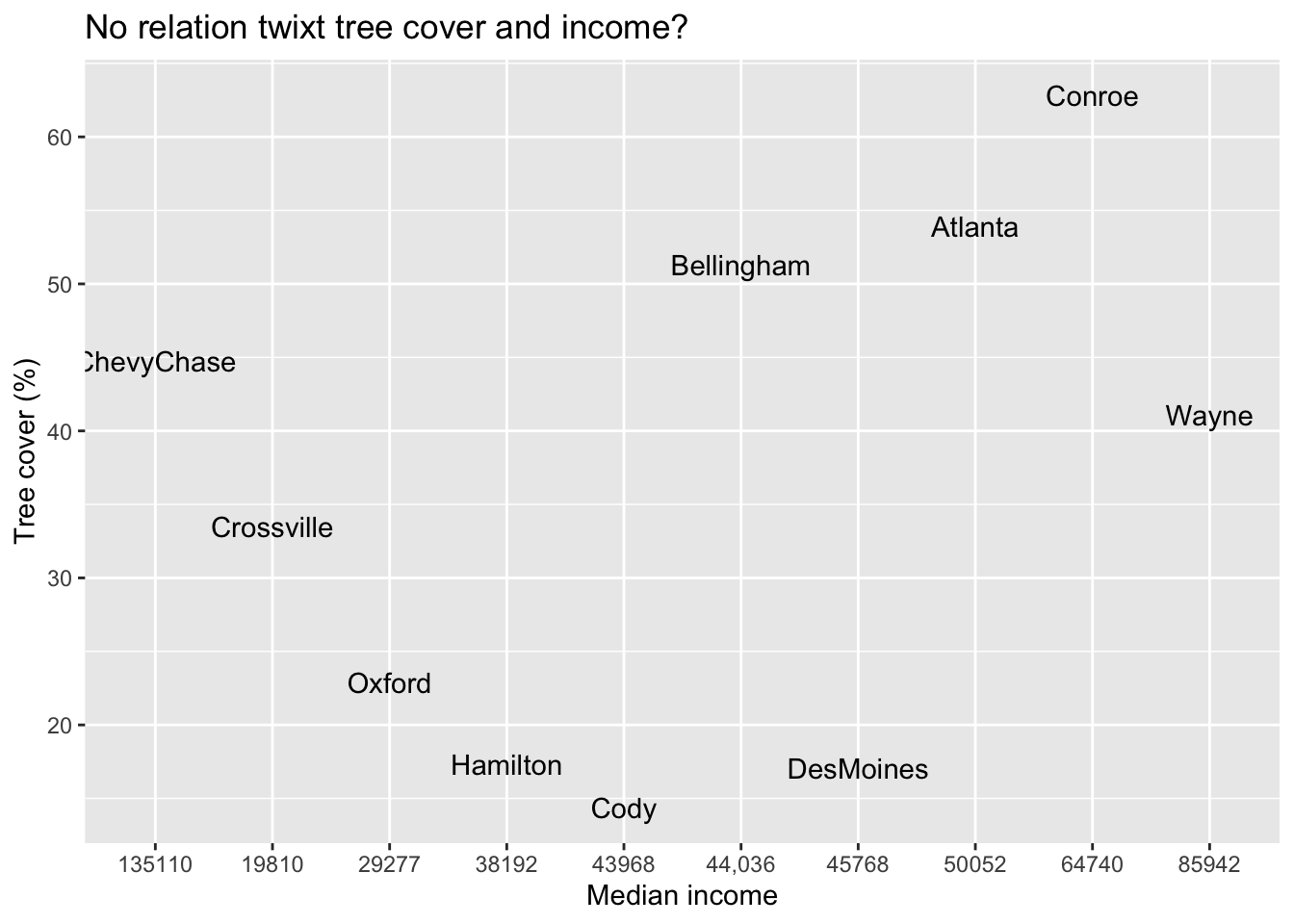
Here is a subset of data I collected on the places where members of my family lives.
Figure 2.1: The noisy but perhaps positive relation between percent of an location covered in trees and the median income of that location.
Refer to the scatterplot of my data (Figure 2.1). What do we find? Discuss the following questions with your colleagues, and propose and explain some possible answers.
Is there a relationship that is consistent with our hypothesis? Does tree cover increase with income?
Notice the cities that I selected. What else do you know about these locations, aside from income, that might influence tree cover?
What else might be going on that helps create this relation or might obscure a stronger relation?
After looking at these data, would you want to select locations in a different way?
2.3 Deliverables
Results and discussion
In one document, put two figures side-by-side:
your bargraph of % tree cover vs. % people in poverty (copied from the Tree Equity site) side-by-side, and
your scatterplot of tree cover vs. median income that you made using everyone’s data, based on the iTree/OurTrees website that you shared in the Google spreadsheet.
include a figure legend that states what the graphs are in a way that is intelligible to a naive reader.
Provide a brief explanation of your findings, including
the results described in a factual manner, without interpretation,
an explanation of whether the results are consistent with the biophilia hypothesis, and
a new question that emerges due to the inconsistencies between the data and the hypothesis; explain why this question is a logical extension of your current results and interpration.
Franklin, Deborah. 2012. “Nature That Nutures.”Scientific American 306 (3): 24–25.
Morin, P J. 1999. Community Ecology. Malden, MA: Blackwell Science, Inc.
Odling-Smee, J, and DH Erwin. 2013. “Niche Construction Theory: A Practical Guide for Ecologists.”The Quarterly Review of Biology 88 (1): 3–28. https://www.jstor.org/stable/10.1086/669266.
Stephens, D W, and J R Krebs. 1986. Foraging Theory. Edited by J. R. Krebs and T. H. Clutton-Brock. Monographs in Behavior and Ecology. Princeton, University Press, Princeton, NJ, USA: Princeton University Press.
Wilson, Edward O. 1984. Biophiia. Cambridge, MA: : Harvard University Press.